Anchorage Museum
Visual Identity, InstallationThe largest museum in Alaska, Anchorage Museum, tells a multi-faceted story that weaves together cultural, scientific, historical, and artistic threads. It connects people, expands perspectives, and encourages dialogue about the North and its distinct environment.
The new visual identity is inspired by its specific natural environments, such as glaciers and ice cubes. The transformation from the right-angle corner to the rounded corner in the logo visually corresponds to when the ice melts. It aims to bring closer the relationship between people, culture, and landscape by emphasizing this geographical characteristic.
The new visual identity is inspired by its specific natural environments, such as glaciers and ice cubes. The transformation from the right-angle corner to the rounded corner in the logo visually corresponds to when the ice melts. It aims to bring closer the relationship between people, culture, and landscape by emphasizing this geographical characteristic.
Logo and Stationery︎︎︎
Customized Typeface︎︎︎
Explored the rounded corner of the letterform to make it visually correspond to the moment when the ice melts︎︎︎

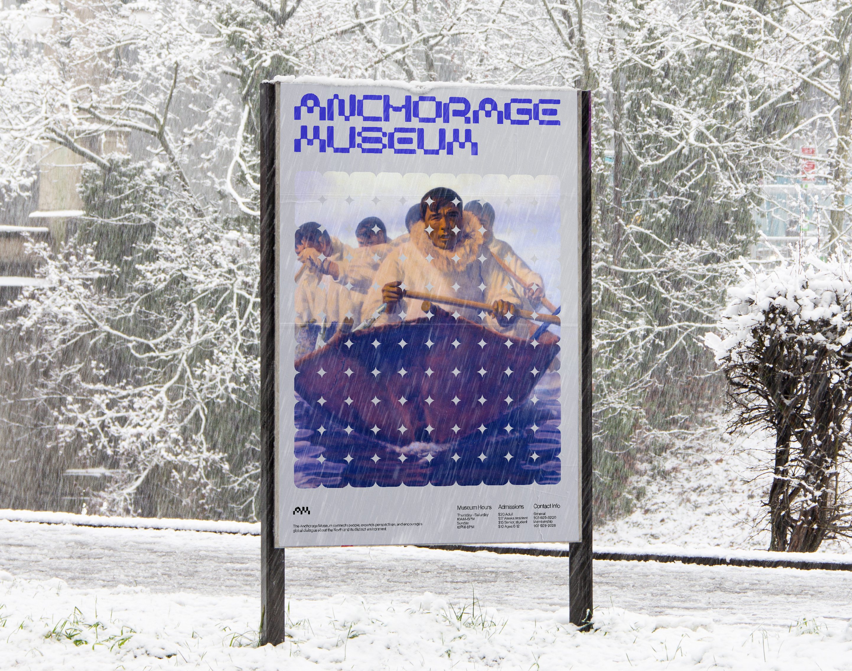
Identity + Calendar Posters︎︎︎
Event Posters ︎︎︎
Expanded grid work as a flexible pattern to frame the story of Alaska.
Expanded grid work as a flexible pattern to frame the story of Alaska.
Museum Ticket ︎︎︎

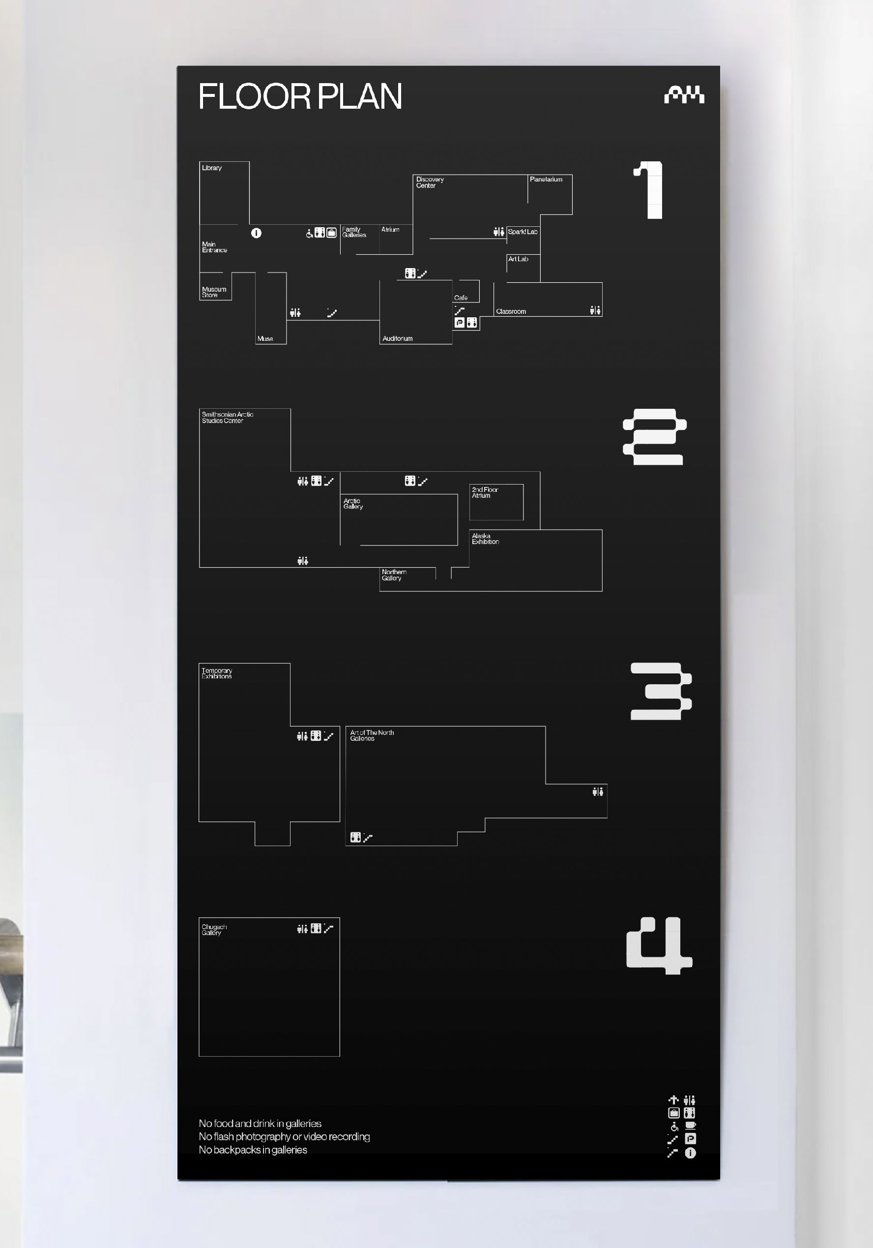
Museum Guide︎︎︎
Mu![]()


Website︎︎︎
The grid elements are used in a flexible way to convey information from large scale to small scale.
The grid elements are used in a flexible way to convey information from large scale to small scale.

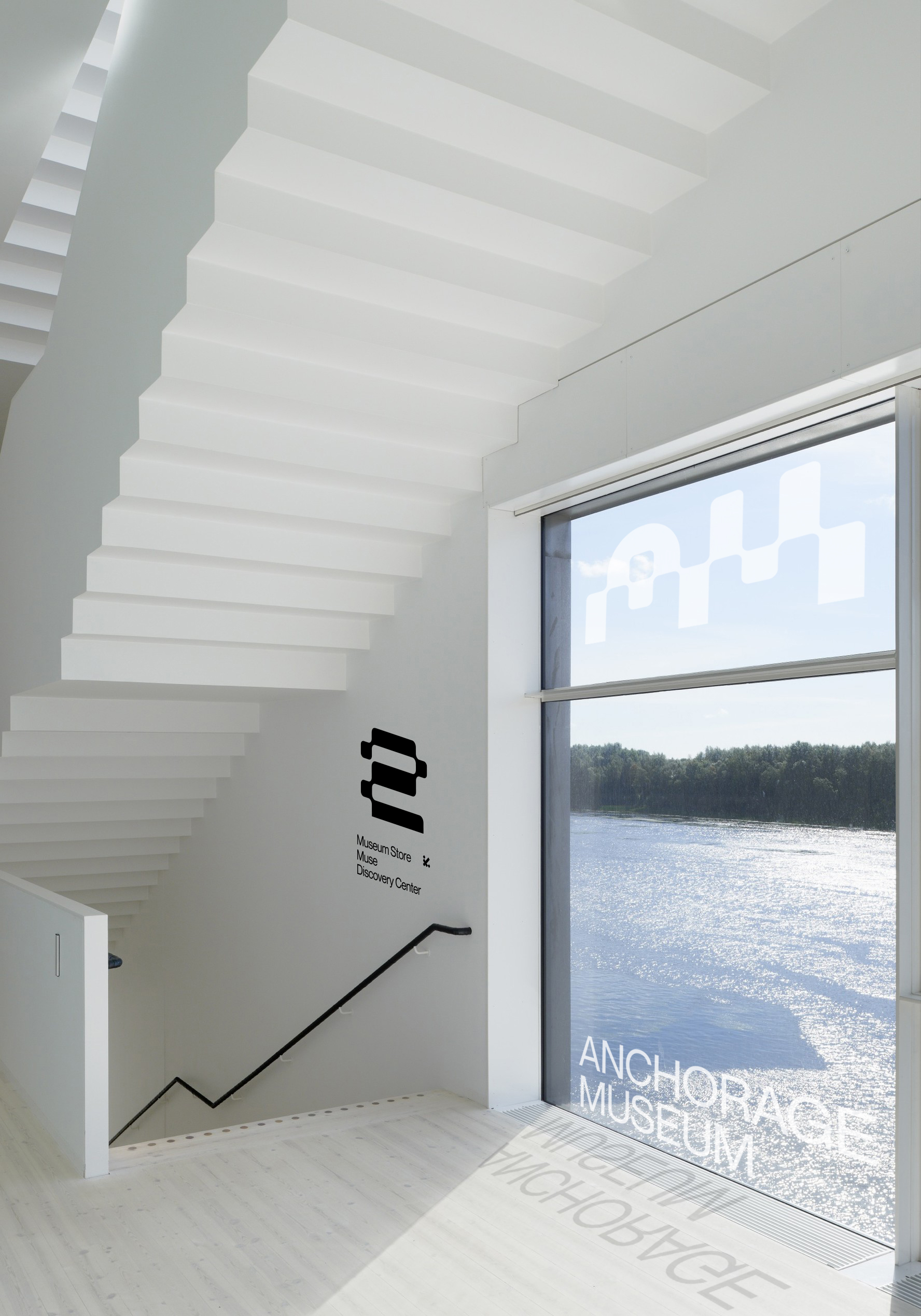
Spatial Design︎︎︎
The iconography is based on the grid of the customized typeface.
The iconography is based on the grid of the customized typeface.
Exhibition Installation︎︎︎
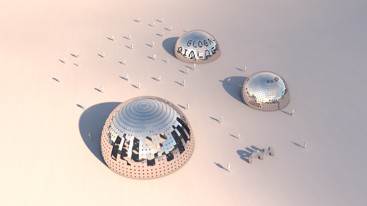
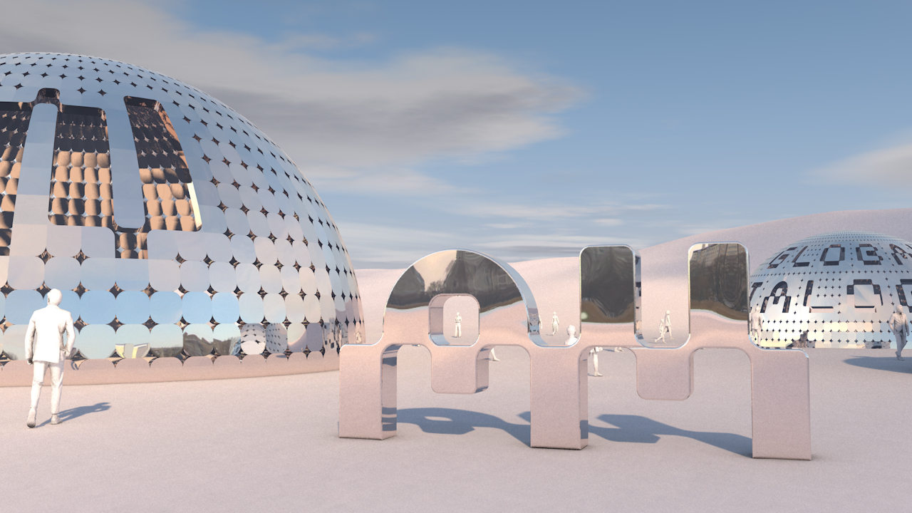
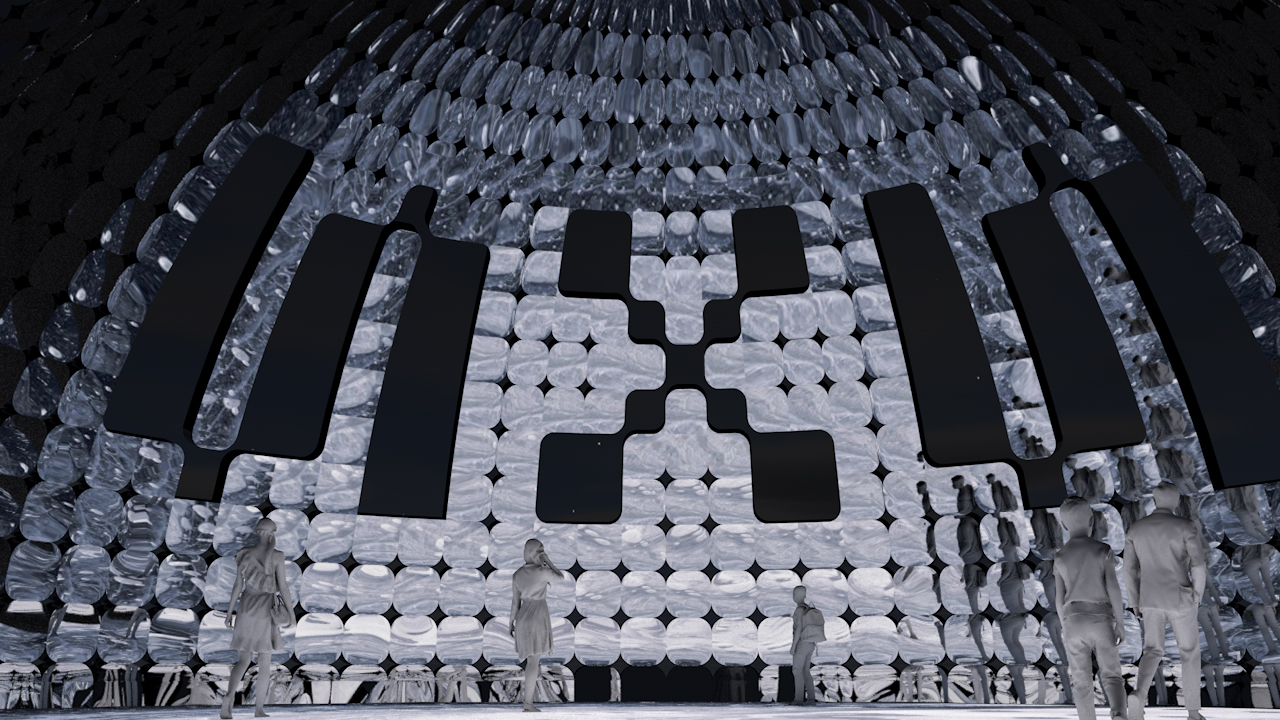
Anchorage Museum curates this hypothetical outdoor installation for North X North 2021, a creative festival. The experience has three different specific domes that allow people to visit. The structure uses the rounded grid element from the identity system. By highlighting the features of the natural environment, the sunlight will go through into the interior and cast shadows on the ground. For the material, it uses reflective steel material that reflects the surrounding environment, bringing nature closer to people’s sight. The purpose is to provide a space that gathers people and invites people to encourage dialogue about the North.